A New Look
19 Feb 2009
I have previously used this site for experiments with new frameworks and testing various integration with external sites such as Twitter or Flickr. The blog format is an easy Hello World type of initial project and I’ve implemented the core parts in the PHP frameworks like Symfony, CodeIgniter and the currently used Zend Framework.
When I last redesigned the blog in October 2007, the typography was based heavily on the Blueprint CSS framework and fitted for blog posts. This worked fairly well.
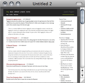
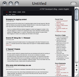
Since then, I’ve added Twitter integration for quick thoughts (now replaced by internal system) and Flickr for photos. The brevity of these notes made the page look cluttered and the distinction between posts was not as clear as it should have been. This was the primary reason for this new look.


I think the comparative screenshots above illustrates the point exactly. There is a much better separation of content in the new on the right and I am frankly appalled at how it looked before with text all over the place. I belive this is a step in the right direction :)