WWDC 2007 Thoughts
13 Jun 2007
Steve Jobs held his anticipated keynote for the WWDC 2007 in San Francisco two days ago. Apple has put up a stream of the keynote for the interested. During that keynote, Steve talked about and demoed 10 new features in the version 10.5 of Mac OS X called Leopard.
I’m gonna go over some of them with a few thoughts.

-
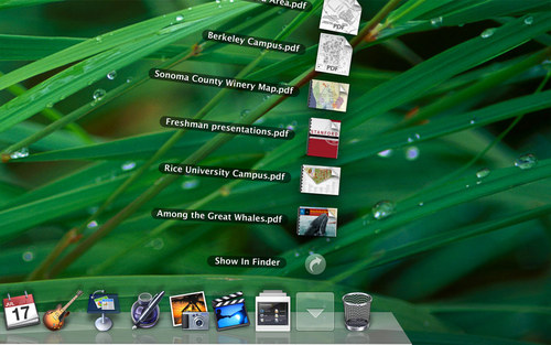
New Desktop - a consistent GUI, a semi-transparent menubar a new Dock with Stacks
The consistent GUI brings with it the playlist type of sidebar that iTunes first introduced and Mail also uses. This is no doubt due to the fact that, according to Steve, 500 million Windows users have downloaded iTunes - they (and practically all Mac users) already know how to use it.
A semi-transparent menubar seems like an odd decision, particularly to long time Mac users. It could help keep focus on the current task (as will the added depth to the active window). However, the menubar is still the only indication of the active application it seems and that will confuse some users. To switchers the change will make their new Mac look more like Windows and ensure association of the Dock with the missing Task bar. I’d have preferred the menubar to fade up on mouseover.
The stacks in the Dock is a great idea and really adds to the useability of folders in the Dock and the addition of a stack for downloaded content is great (for those new to the platform). I’d love to have stacks elsewhere, on the Desktop for instance, but I doubt it.
The 3d effect with reflections in the Dock is useless but help sell computers and, I suppose, make the UI look more ’live’ - important when you’re competing with Vista.
-
Using the aforementioned playlist from iTunes is a welcomed improvement over the hackish implementation that is the current Finder sidebar.
Including default smart folders is a smart move - something even Vista has. I hope Spotlight 2.0 will bring vastly improved creation of smart folders.
The column view preview, unfortunately, does not seem to include the ability to set Spotlight keywords - something I’ve missed from day one. Of course, this might change come October. I hope the Save dialogs have this option as well.
I’d really like to see a scaling slider in the lower left corner of Finder windows for changing icon sizes like iPhoto scales photos.
Coverflow in Finder looks good and is very nice for browsing photos or just anything recognizable in small. It would, however, seem useless for browsing text heavy documents.
-
Quicklook is just plain cool
-
Even though I’ve recently automated backup to a remote server, having a built in solution with history will benefit all. I wonder how fast it will be browsing/searching back through time though. The rumored addition of the ZFS filesystem would help in this regard.
Another thing yet to be seen is how well it behaves on portables where the backup drive might not be connected at all times.
-
Bringing RSS feeds to Mail makes perfect sense to me. It is very much like a web version of newsletters. Data detection (though hardly new, Apple once had something called Apple Data Detectors that did the same) is a very nice addition and something I expect to be system wide.
I have no intention of using the HTML templates. Much like text documents (.txt or .rtf over .doc), I prefer mail as plain as possible.
-
GPU accellerated animations in every program is sure to bring some GUI experiments. It is the next step of Quartz Extreme and it will be interesting to see how developers - and Apple - put this to use in the future. I’m sure iPhoto, for instance, could benefit from it when dealing with massive amounts of photos.
That was my take on some of the stuff we’ll see in the Leopard. Please share your thoughts in the comments - there is still a long time till October…